Why Some Blog Themes Age Better Than Others
An analysis of why certain WordPress blog themes remain visually coherent and functionally sound over many years while others feel dated within months.
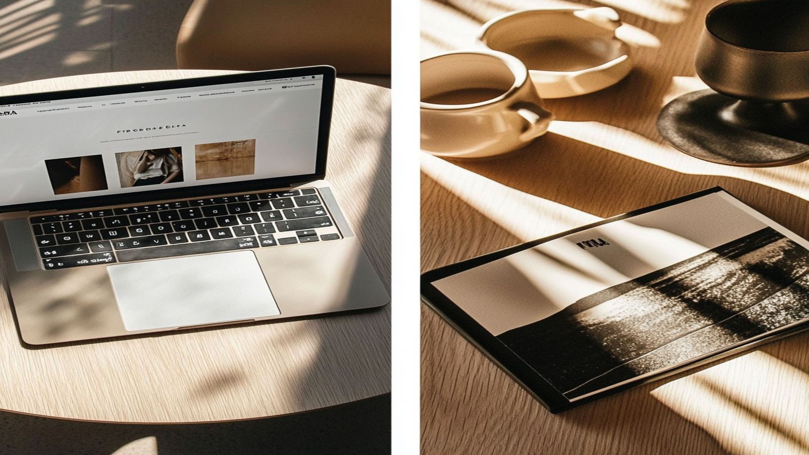
Some WordPress themes from 2012 still look coherent today. Others from 2019 already look dated. The difference is not accident and it is not entirely a matter of taste. There are specific structural and design decisions that make themes age well, and they are observable.
The Role of Decorative Trends
Most rapid visual aging comes from decorative choices that were distinctive at the moment of their introduction. Gradient backgrounds, drop shadows on every box element, large textured hero images, glossy buttons, animated CSS ribbons in corners. These were design trends that gave themes a contemporary look within a particular window of time. The problem with building identity around a trend is that the trend moves on while the theme does not.
Themes that age poorly typically have one thing in common: visual ornamentation that was doing the work of character. The ornamentation was applied to be noticed, and it was noticed as modern at the time. When that style marker stops signaling modernity and starts signaling its own specific era, the theme reads as a period piece.
Themes that age well tend to be decorated sparingly, if at all. Their character comes from proportion, spacing, and type choices rather than surface-level stylistic markers.
Semantic Markup and Long-Term Stability
A theme that is built on solid semantic HTML ages better from a technical standpoint because the fundamentals do not change. HTML has had <article>, <aside>, <nav>, <header>, and <footer> as established elements for over a decade. A theme that uses these elements correctly in 2012 was easier to maintain in 2015 and is still easy to reason about now.
Themes built on non-semantic markup (nested <div> structures with class names that describe visual position rather than content meaning) create technical debt. When browser defaults change, when accessibility standards evolve, or when screen sizes diversify beyond what the original design anticipated, semantically structured themes adapt more gracefully.
The same applies to CSS. Themes written with clear, well-named classes that describe content roles rather than visual properties are more resilient to visual redesign without markup changes. A theme where the reading column is .content and the sidebar is .sidebar can be restyled entirely with new CSS. A theme where everything is .left-col-960 or .right-box-blue ties structure to presentation in ways that are harder to maintain.
Typography Independence
Typography choices that depend on third-party CDNs for web fonts introduce a hidden fragility. A theme that loads its primary typeface from an external service works perfectly today and may work years from now, but the theme's visual integrity is contingent on that service remaining available, maintaining the same font files, and serving them at acceptable speed.
Themes that self-host their fonts (or use system font stacks that are available on all modern operating systems) have no external dependency for their typography. The reading experience is the same regardless of network conditions, geographic location, or the status of any external provider.
System font stacks have improved substantially. For reading-focused themes, the modern system sans-serif stack (which resolves to San Francisco on Apple devices, Segoe UI on Windows, and Roboto on Android) provides a comfortable reading experience. Paired with a carefully chosen self-hosted serif for longer reads, a theme can have distinctive typography without external risk.
Layout Logic That Accounts for Change
The content-plus-sidebar two-column layout has been the dominant blog structure for fifteen years. The reason it has persisted is not that it is perfect but that it is flexible. The sidebar can hold whatever secondary information the site needs at any given time, and that need changes as sites evolve.
Themes that impose rigid layout systems that cannot accommodate changing content requirements age quickly in practice even if they age slowly visually. A theme where adding a widget to the sidebar breaks the grid, or where a longer-than-expected title causes layout failures, creates ongoing maintenance friction.
What makes a layout age well is that it accommodates variability gracefully. Long titles wrap. Wide images scale down. Empty sidebar areas collapse. An unknown quantity of navigation items fits within the header navigation. These behaviors are not automatic; they are choices made in how the CSS is written.
The Slowness of Good Judgment
There is a practical implication to all of this: the themes that age best are usually not the most exciting at the moment of release. They do not have the most distinctive visual style in their category at launch. Their character comes from doing the ordinary things (text, lists, images, navigation, spacing) with consistent quality rather than from a striking visual treatment.
This is a durable quality because it does not depend on the design trends of any particular moment. Proportionate spacing and legible typography were good in 2010 and they are good now. That is not a coincidence; it is the result of these choices being grounded in how reading works rather than in what was fashionable.
Blaskan is built with these priorities. For documentation on how specific layout choices were made, see the documentation overview. For pattern analysis, see the pattern bench. For a full overview of the theme's design background, see the theme guide.