What Makes a Reading Theme Feel Light
An examination of the perceptual and technical factors that make some WordPress reading themes feel light and fast, while others feel heavy despite similar content.
Two themes can load the same content in the same number of seconds and feel completely different. One of them feels quick and easy to read. The other feels heavy, as if there is too much happening on the screen. The difference is rarely speed in the technical sense. It is perception.
This distinction matters because it separates two different problems that are easy to conflate. Technical performance (page load time, time to first byte, largest contentful paint) can be measured precisely and improved with known techniques. Perceived lightness is a different thing. It is about visual weight, cognitive load, and the conditions under which reading becomes effortless rather than effortful.
Technical Performance and Perceived Performance Are Not the Same
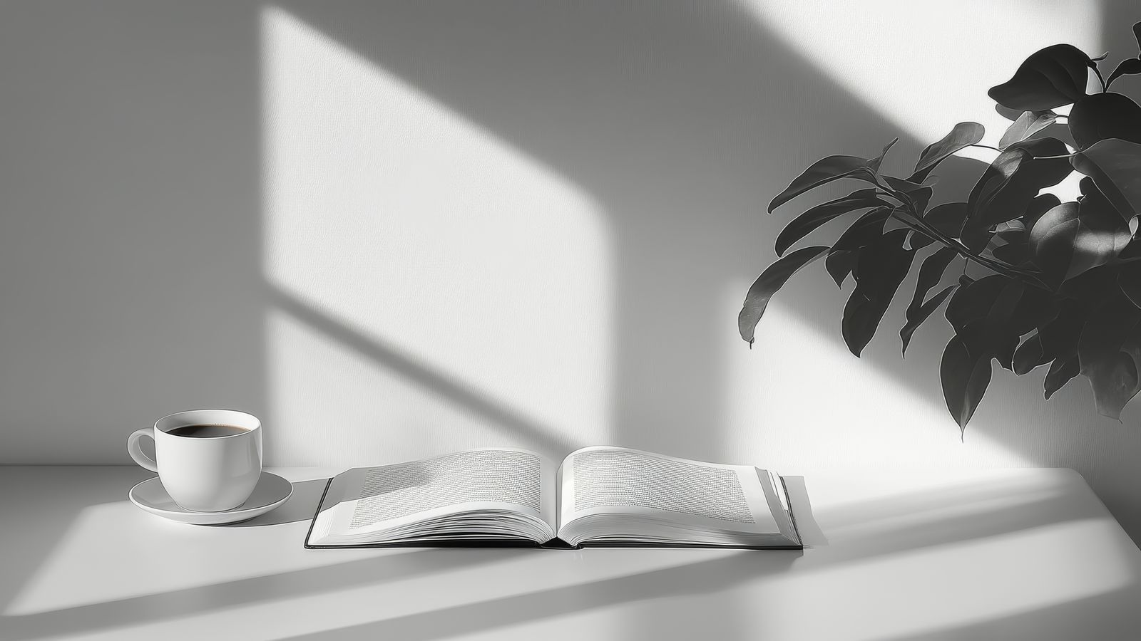
A theme that loads in 1.2 seconds with a cluttered, high-contrast, element-dense layout may feel slower to use than a theme that loads in 1.8 seconds with generous white space and clear hierarchy. The second theme loads later but feels lighter once it arrives.
This is not a reason to ignore technical performance. Load time affects whether readers arrive at all; perceived quality affects whether they stay and come back. Both matter. But the two improvements are achieved by different means.
Technical performance for a WordPress reading theme depends on: the number of HTTP requests the theme makes, whether fonts are loaded efficiently or blocking, how stylesheets are structured, and whether the theme loads JavaScript it does not need. A well-built reading theme requires very little JavaScript. Most of what makes a blog work (navigation, typography, layout, images) is CSS and HTML.
Perceived performance depends on something different.
What Creates the Feeling of Lightness
Visual lightness comes from restraint. Specifically, from restraint in the number of competing elements on the page, the contrast used for secondary information, and the density of content in the reading area.
White space is the most consistent factor. White space around paragraphs, between sections, and around the content frame signals that the page is not fighting for your attention. It is giving you room to read. The typographer Jan Tschichold, who formalized many of the principles still used in book typography today, treated white space as a structural element with as much significance as text. In digital reading, this principle applies directly. A page with generous margins and inter-paragraph spacing does not feel empty; it feels considered.
Font rendering is the second major factor. A body typeface that renders crisply at screen resolution and sizes (16px to 18px is the reliable range for extended reading) removes the mild effort of decoding poorly rendered letterforms. Fonts that are slightly too small, too light-weight, or not optimized for screen hinting introduce a low-level friction that readers feel as fatigue without identifying the cause.
Color contrast between text and secondary elements affects how much the eye has to work to establish hierarchy. Body text should be clearly darker than metadata, labels, and secondary links. When everything on the page is close to the same value, the eye has no visual hierarchy to rely on and must read more carefully to establish what is important. Light themes with true black text on white background can create the same problem in reverse: excessively high contrast on very bright white backgrounds produces glare fatigue on extended reading sessions.
What Creates the Feeling of Heaviness
Too many typefaces. Each typeface the eye encounters requires a small adjustment as the brain recognizes it as a separate system of marks. A page with three or more distinct typefaces is not necessarily harder to read, but it is busier. One serif for body, one sans for UI elements, and a monospace for code is a well-bounded set.
Competing color accents. A theme with blue links, a green navigation bar, orange post labels, and red error states has four distinct accent colors signaling different things. The eye reads all of them as calls to attention simultaneously. A restrained color palette with one primary accent and neutral backgrounds eliminates this competition.
Element density in the sidebar and header. Heavy sidebars with many widgets, heavy headers with multiple navigation rows, and toolbars that persist through the reading experience all maintain a background level of activity that makes the reading context feel less settled.
Animation and motion. CSS transitions on hover states and loading animations are ubiquitous in modern theme design. Individually, each is subtle. Collectively, a page with hover effects on every link, a sticky header that animates on scroll, and a lazy-loading image reveal is a page with continuous low-level motion. For reading-focused content, motion serves no purpose that stillness does not serve equally well.
Applying This to Blaskan
Blaskan's design choices are oriented toward these principles. The font stack is three typefaces. The color palette is neutral with a single accent. The sidebar is available but not required. The theme makes no HTTP requests to third-party servers by default.
These are not aesthetic opinions. They are structural decisions that support the primary use case: reading long-form text on a blog. The pattern bench documents specific layout patterns in more detail. For accessibility considerations related to contrast and line length, see color contrast, line length, and scannability.